
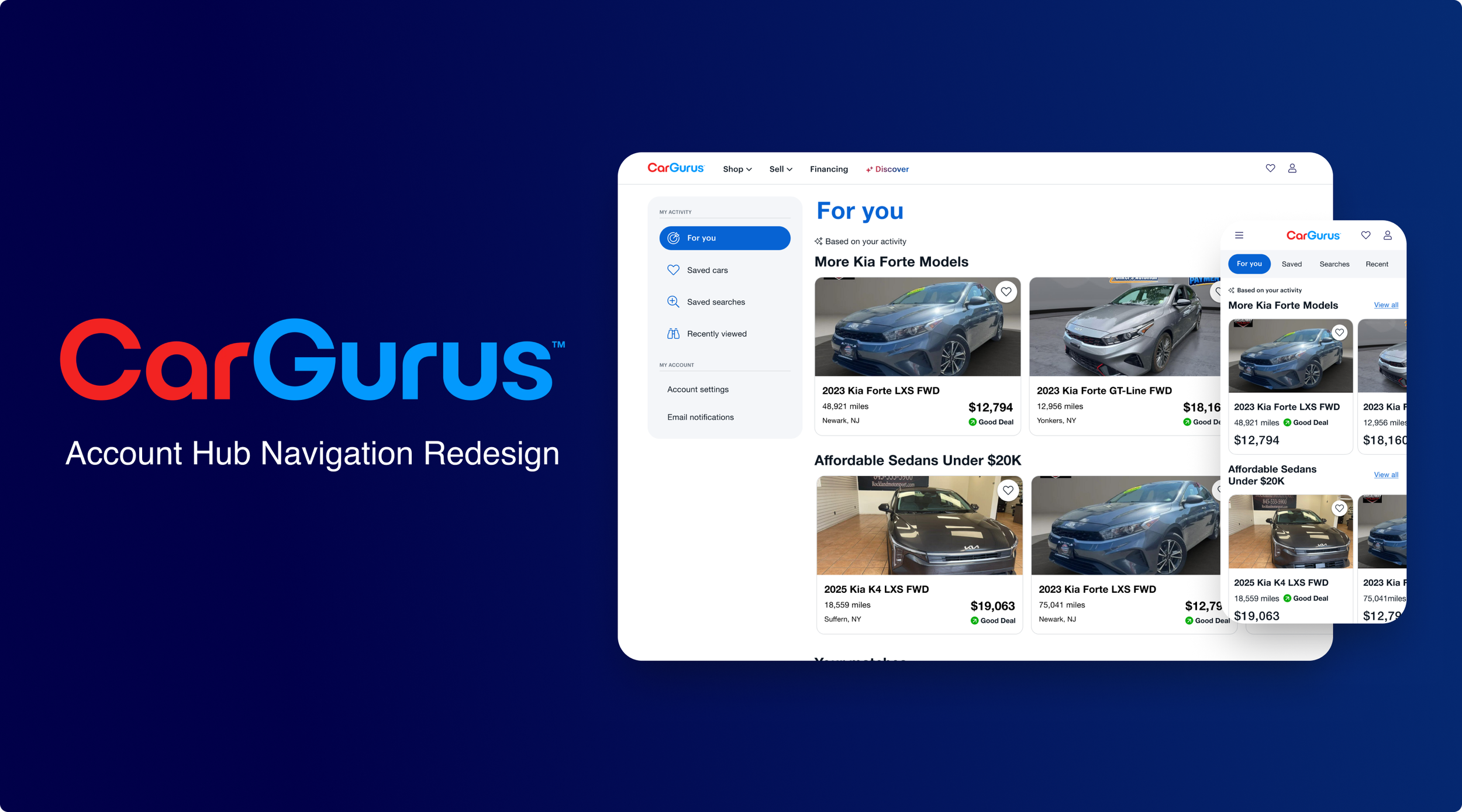
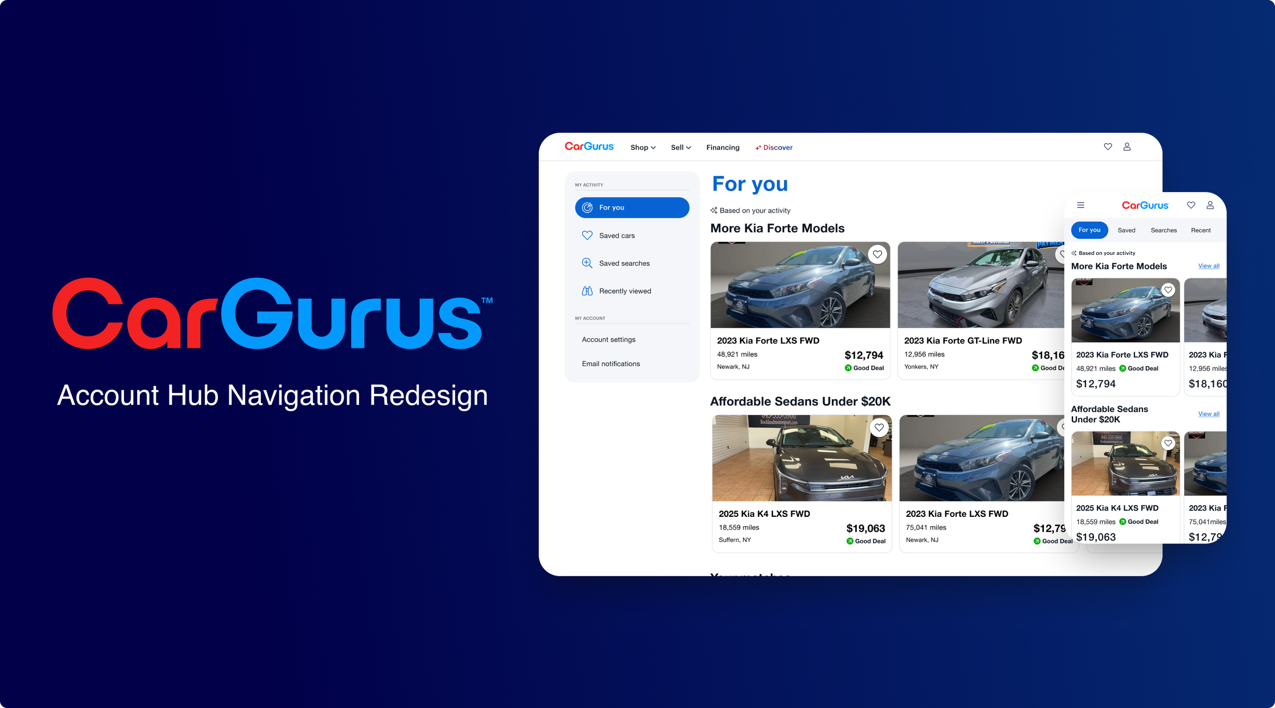
Overview
As CarGurus expanded its Account Hub with personalized recommendations, saved vehicles, saved searches, recently viewed cars, notifications, and account settings, the existing navigation was becoming increasingly difficult to scale.
I redesigned the navigation across desktop and mobile to improve discoverability, create clearer hierarchy, and establish a foundation that could grow alongside the Account Hub.
Project Details:
Role: Senior Product Designer
Team: Product, Engineering, Design
Tools: Figma, Claude, Claude Design, Jira
The Problem
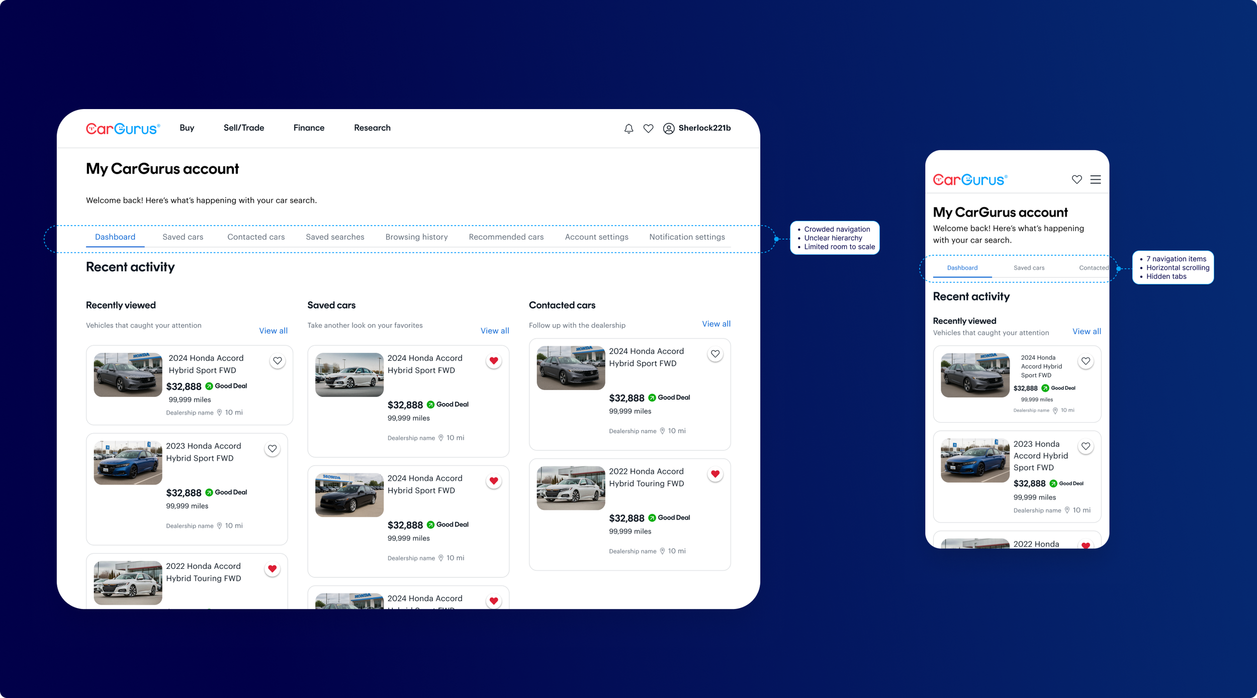
The Account Hub had outgrown its horizontal navigation.
On desktop, the growing number of destinations made the navigation increasingly crowded. Every page carried similar visual weight, making the hierarchy difficult to scan and leaving limited room for future features.
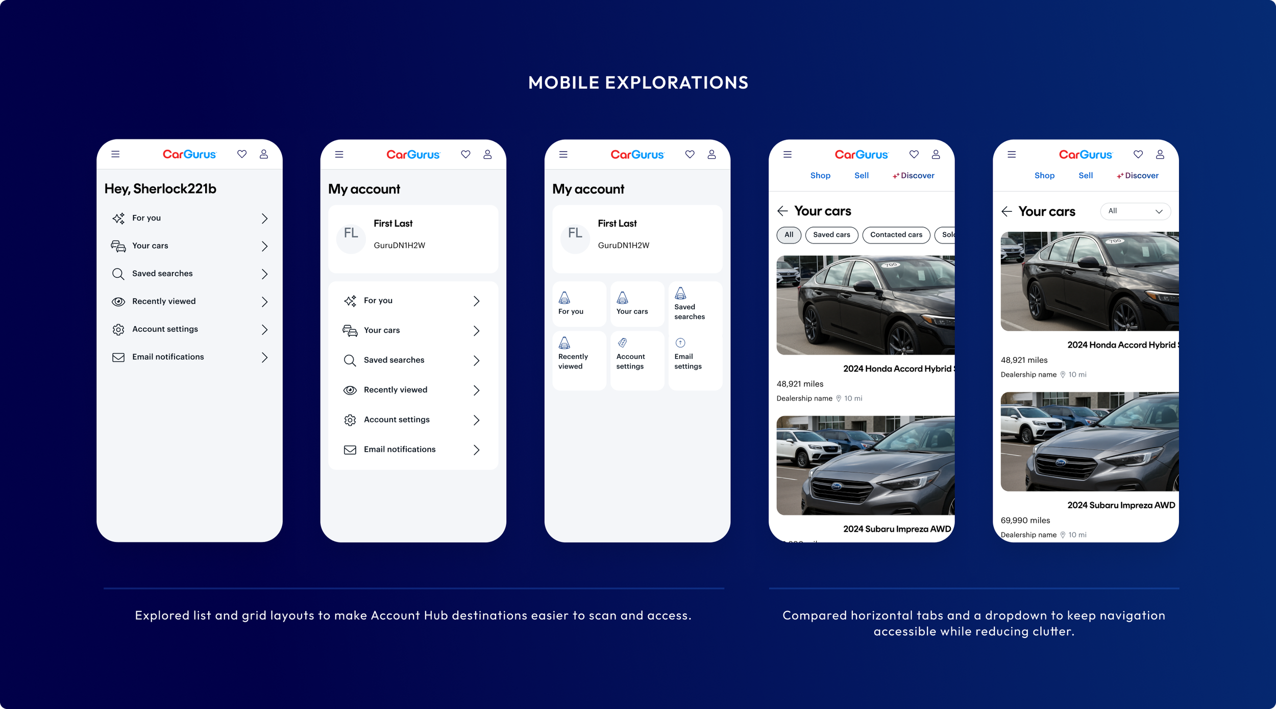
On mobile, seven navigation items created horizontal scrolling, leaving important destinations outside the viewport and making additional pages easy to miss.
The Objective
The goal was to create a navigation foundation that worked across screen sizes while giving Account Hub room to grow.
Discoverable: Make important destinations easy to find.
Scannable: Help shoppers quickly understand where they are and where they can go.
Scalable: Support future Account Hub features without adding navigation complexity.
Discovery
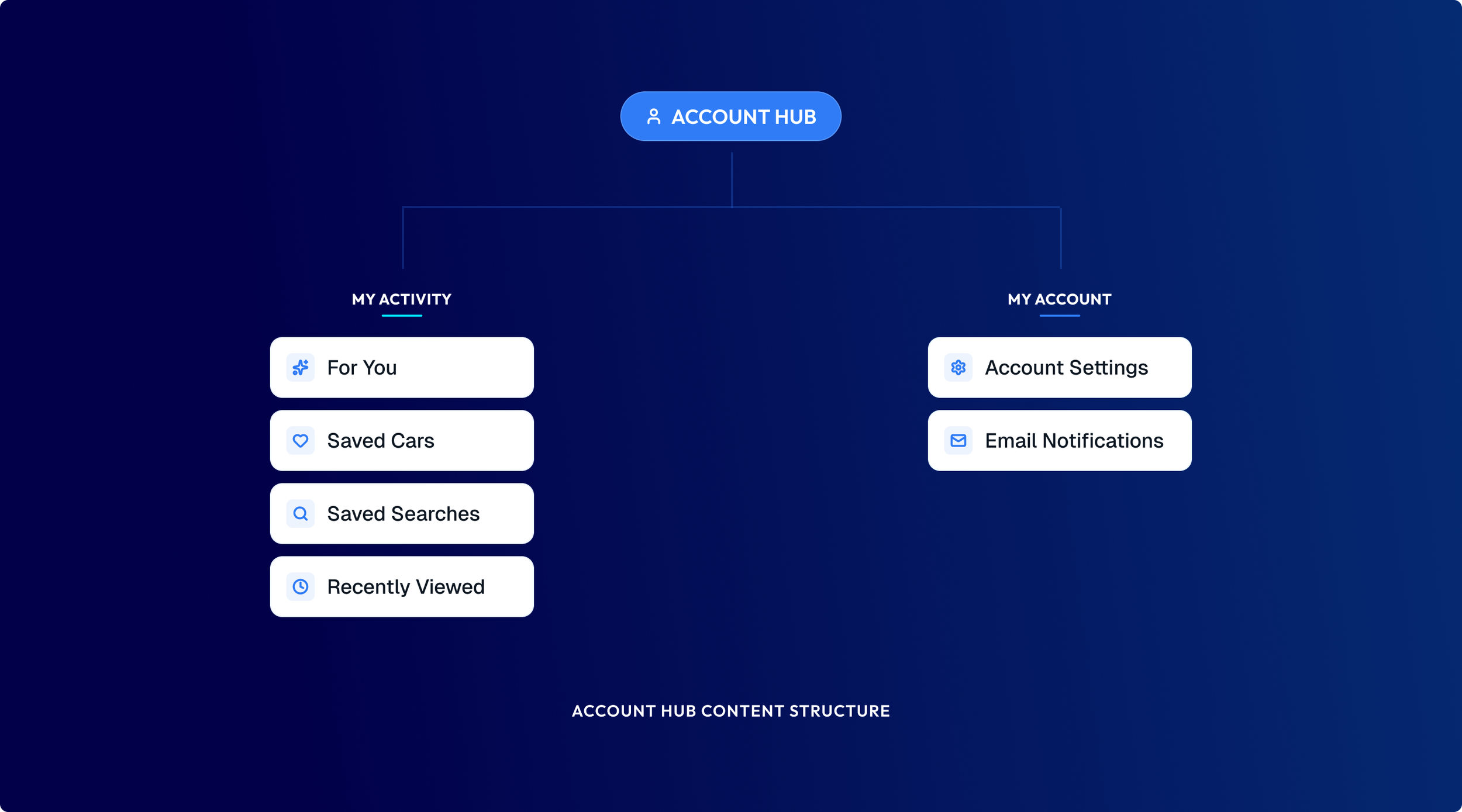
I audited the existing experience across desktop and mobile to understand where the navigation was breaking down. I looked at how shoppers moved between personalized shopping activity and secondary account-management tasks, while exploring established navigation and information-architecture patterns that could support a growing Account Hub.
This helped frame the challenge as more than fitting additional links into the interface, it was about creating a clearer hierarchy around the experiences most relevant to returning shoppers.
Using AI in My Design Process
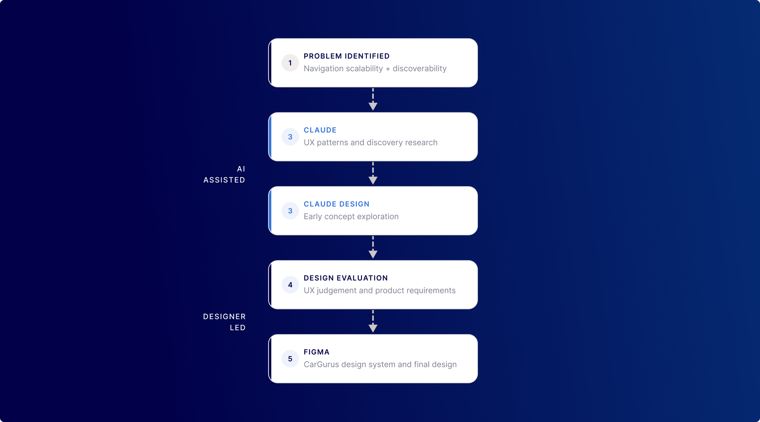
AI became a useful tool for accelerating the early stages of the project. I used Claude to explore UX patterns and considerations related to the navigation problem, then used Claude Design to quickly explore possible directions.
The generated concepts were starting points rather than final solutions. I evaluated and refined them against product requirements, responsive behavior, and the existing CarGurus design system before developing the final designs in Figma.
Exploration
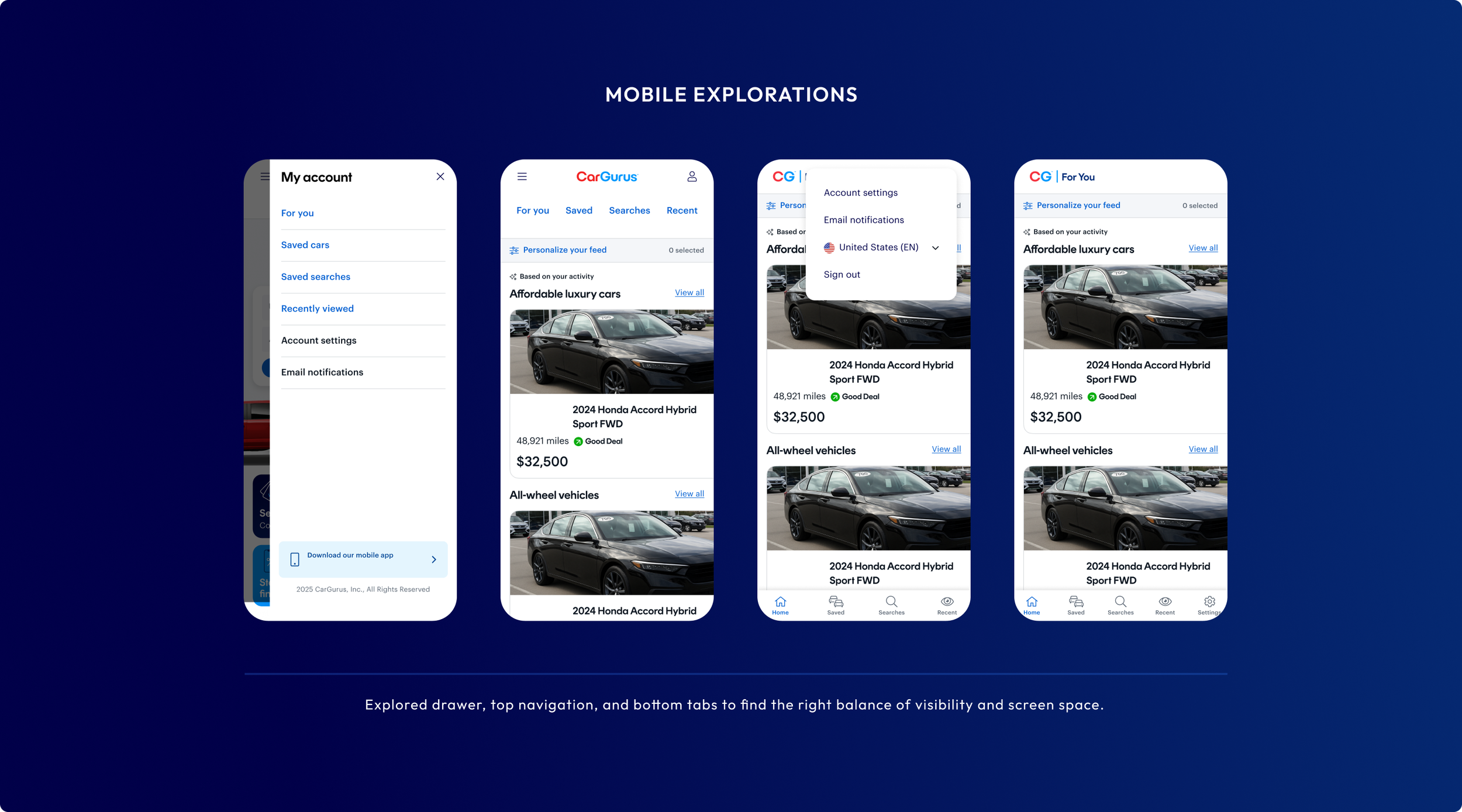
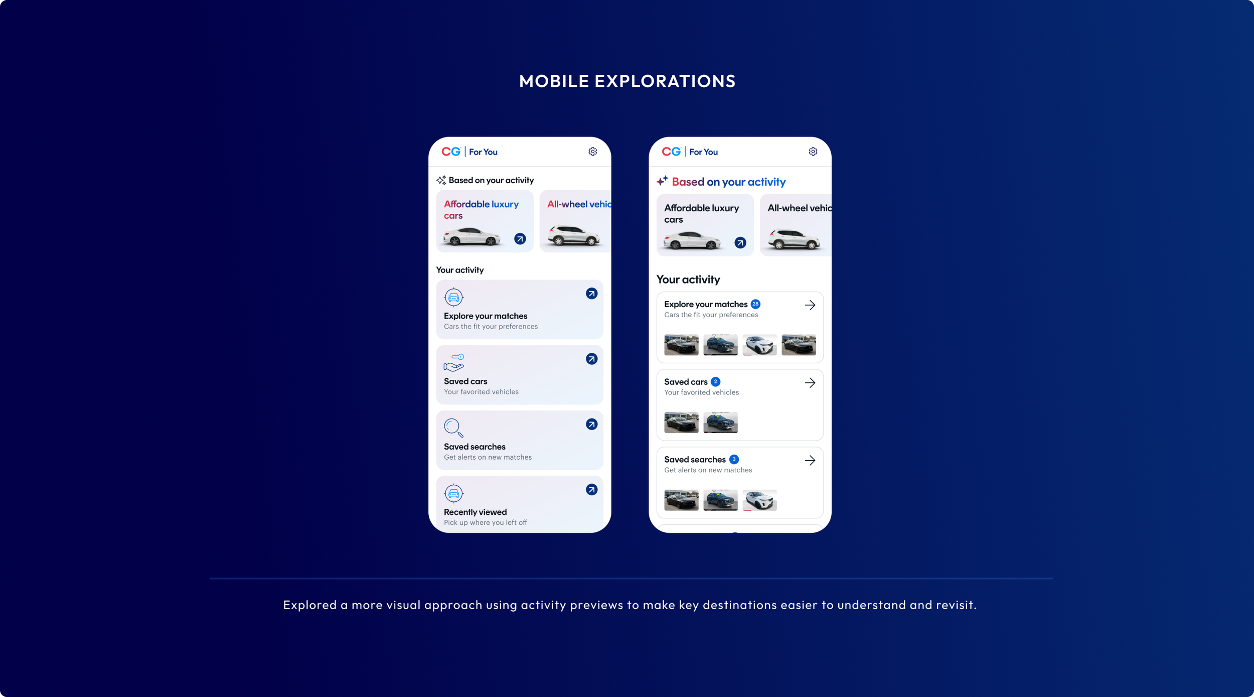
Because most Account Hub users were on mobile web, I focused my early exploration on the mobile experience. I explored several navigation patterns to balance discoverability, scalability, and limited screen space.
After reviewing the concepts with Product and Engineering and aligning on a direction, I adapted the approach for desktop—taking advantage of the additional screen space to create a clearer, more persistent navigation structure.
Final Design
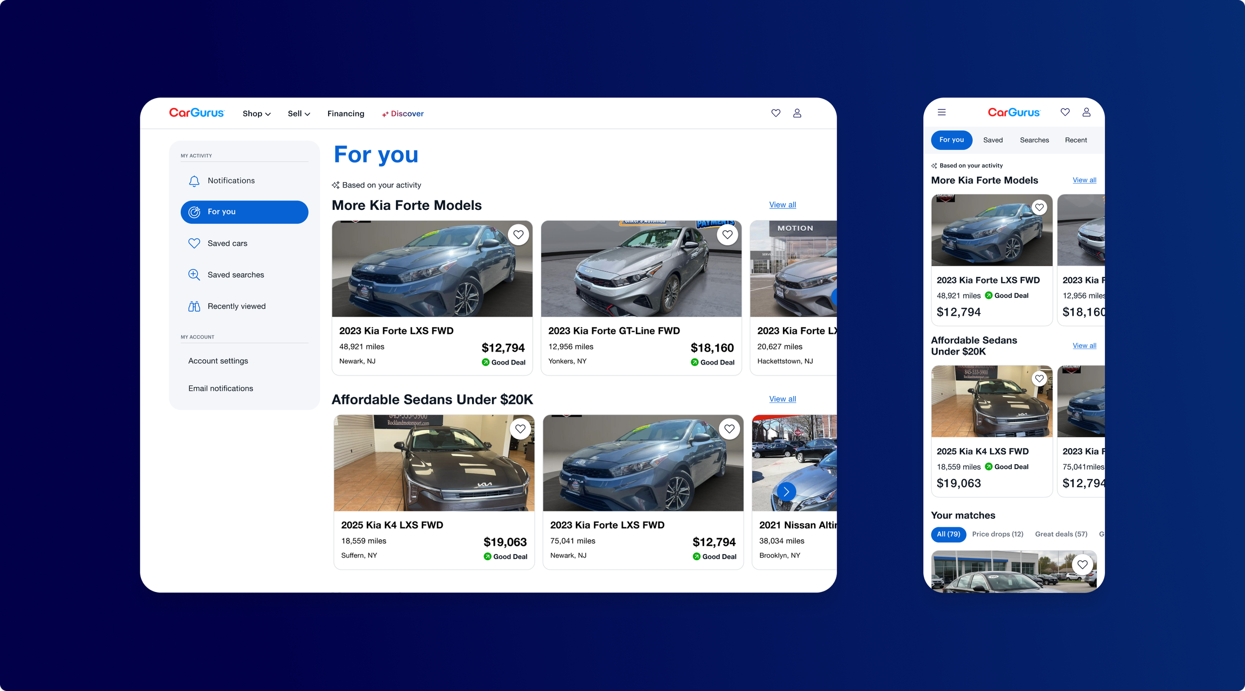
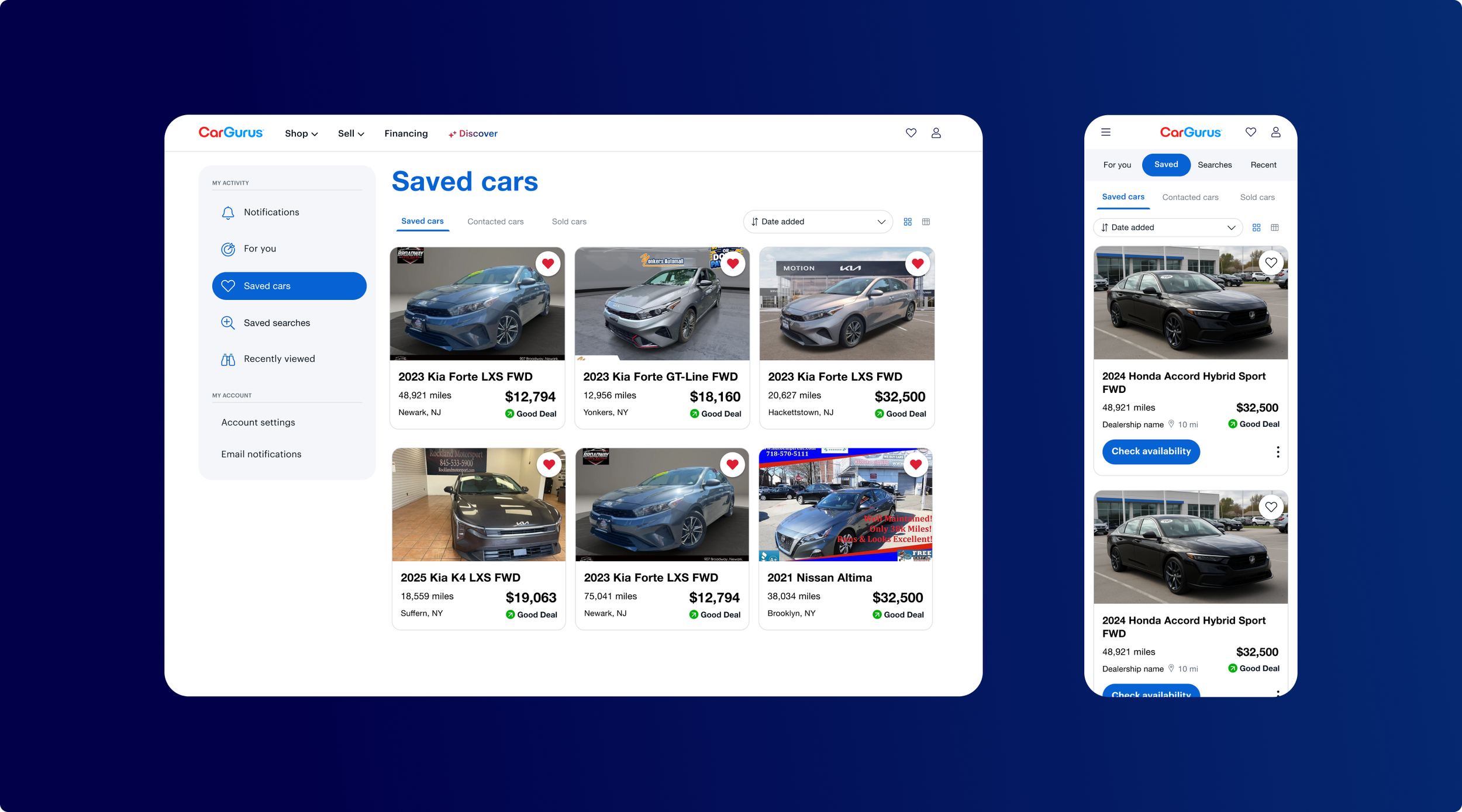
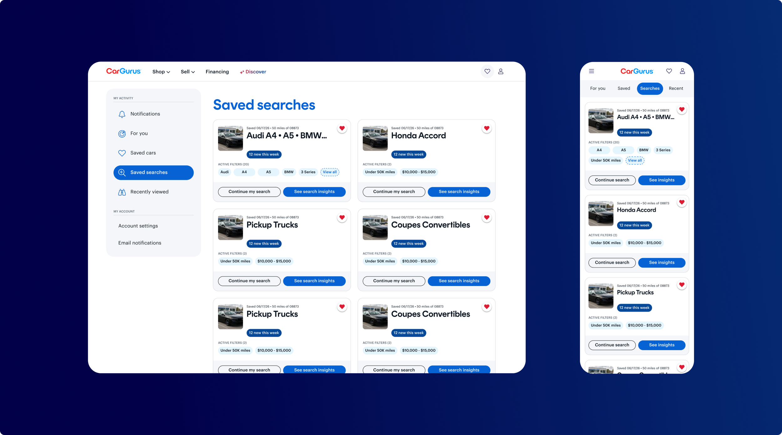
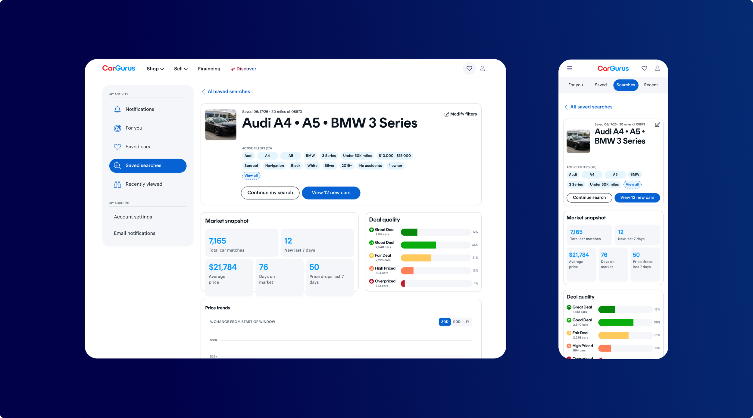
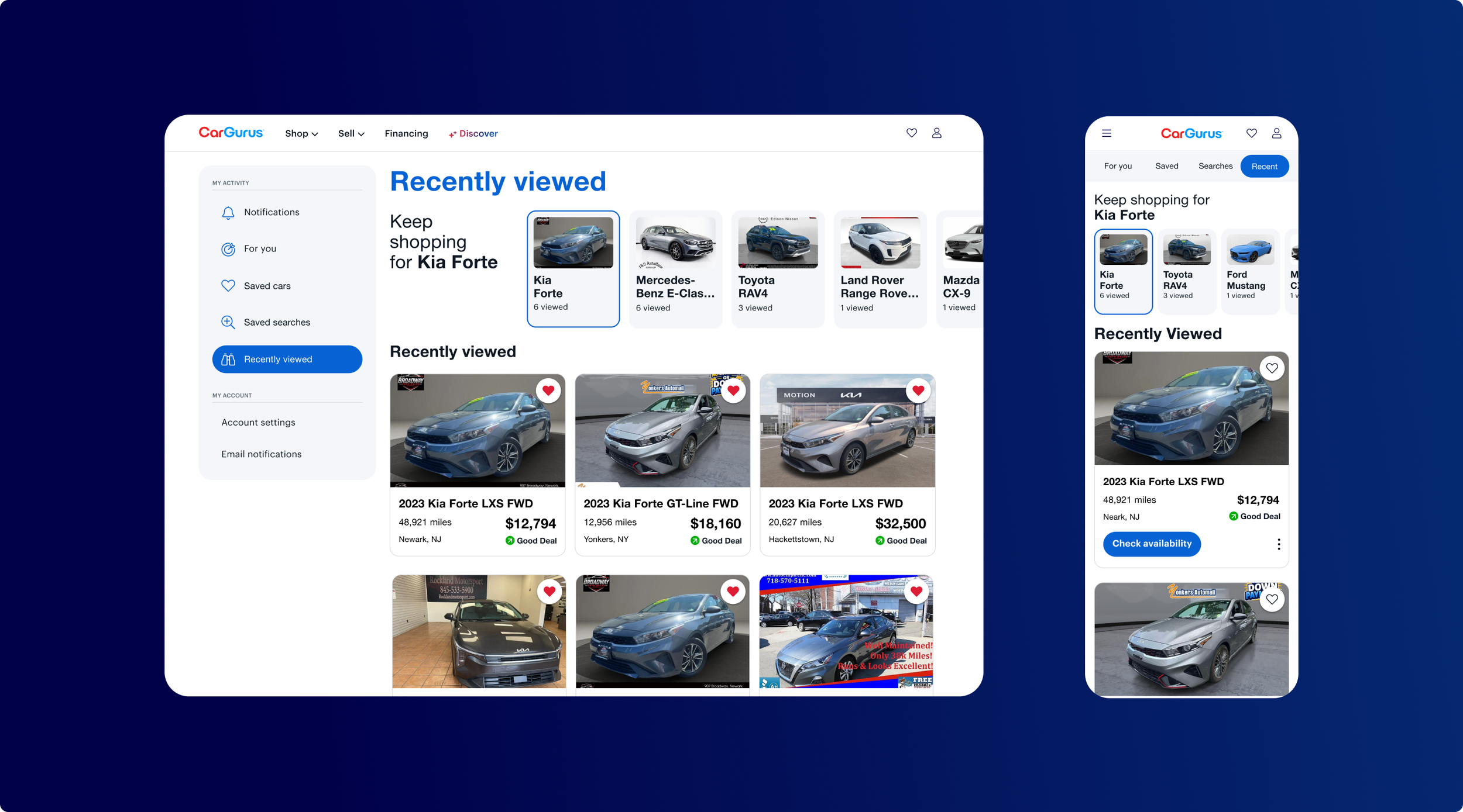
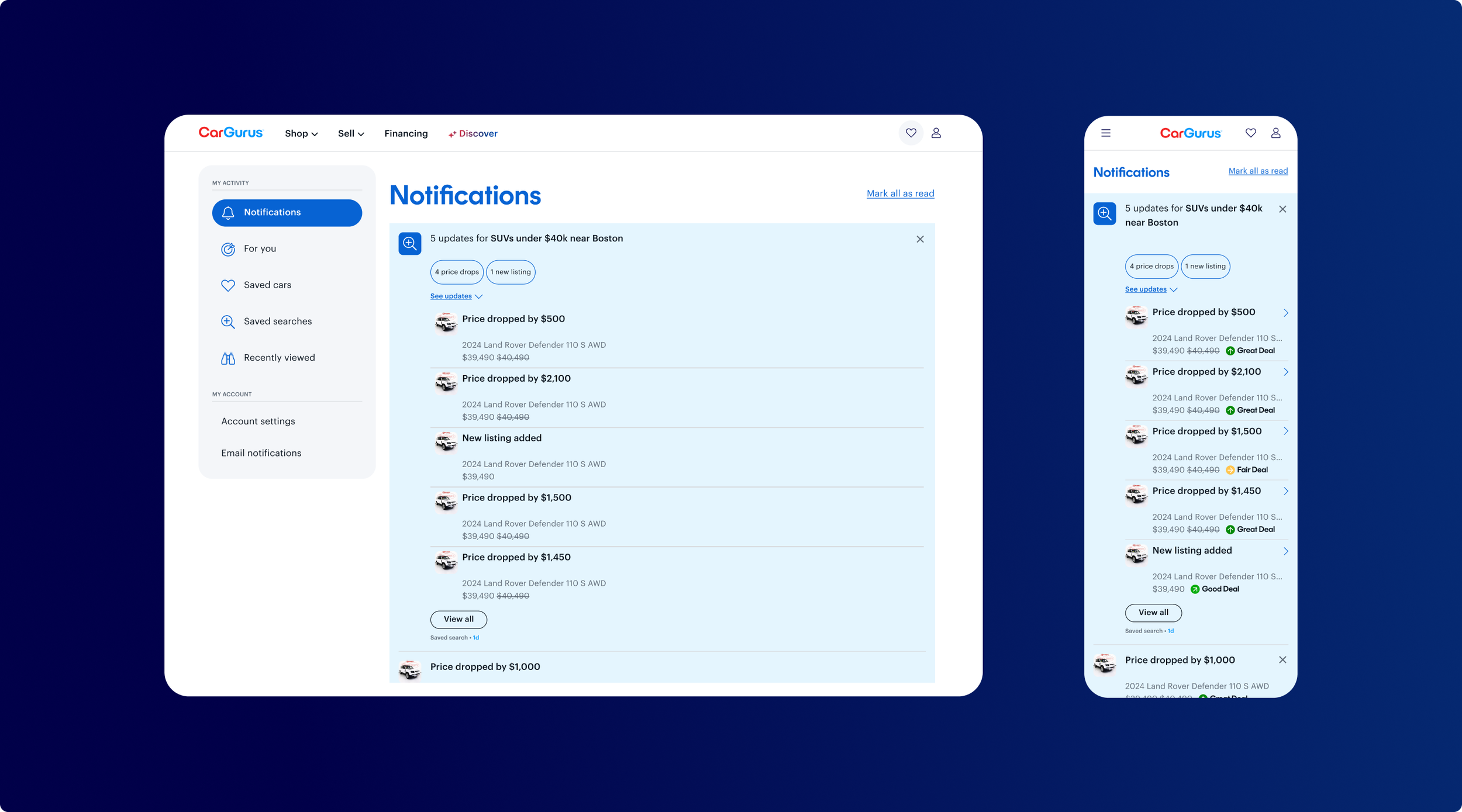
The final direction adapted the navigation to the needs of each screen size.
On desktop, a persistent left navigation creates stronger hierarchy between shopping activity and account management while providing room for Account Hub to expand over time.
On mobile, the simplified navigation keeps the four primary shopping destinations visible and immediately accessible.
Results
The redesigned navigation was released to users and evaluated using live product performance data.
+2.4% Mobile conversion lift
63K Projected leads per year
The results demonstrated that improving navigation clarity wasn't only a usability improvement—it translated into measurable business impact.
What I’d Do Differently
The results validated the direction, but the project also highlighted opportunities to strengthen the design process.
Earlier qualitative validation
I would incorporate usability testing earlier to better understand how shoppers interpret the new navigation before validating the solution through behavioral data.
Separate the problem from the solution
AI made it easier for everyone on the team to quickly visualize ideas, but that introduced a new challenge. AI-generated concepts were sometimes included directly in Jira tickets, which could unintentionally narrow exploration before design began.
Going forward, I would align with Product on the problem and desired outcome first, then use AI collaboratively to explore a broader range of solutions.